Overview
Interface design for a Solo Worker Android mobile application. Users have the ability to “Check-In” to notify employers that they are safe on the worksite when working remotely or as a lone worker.
Challenge
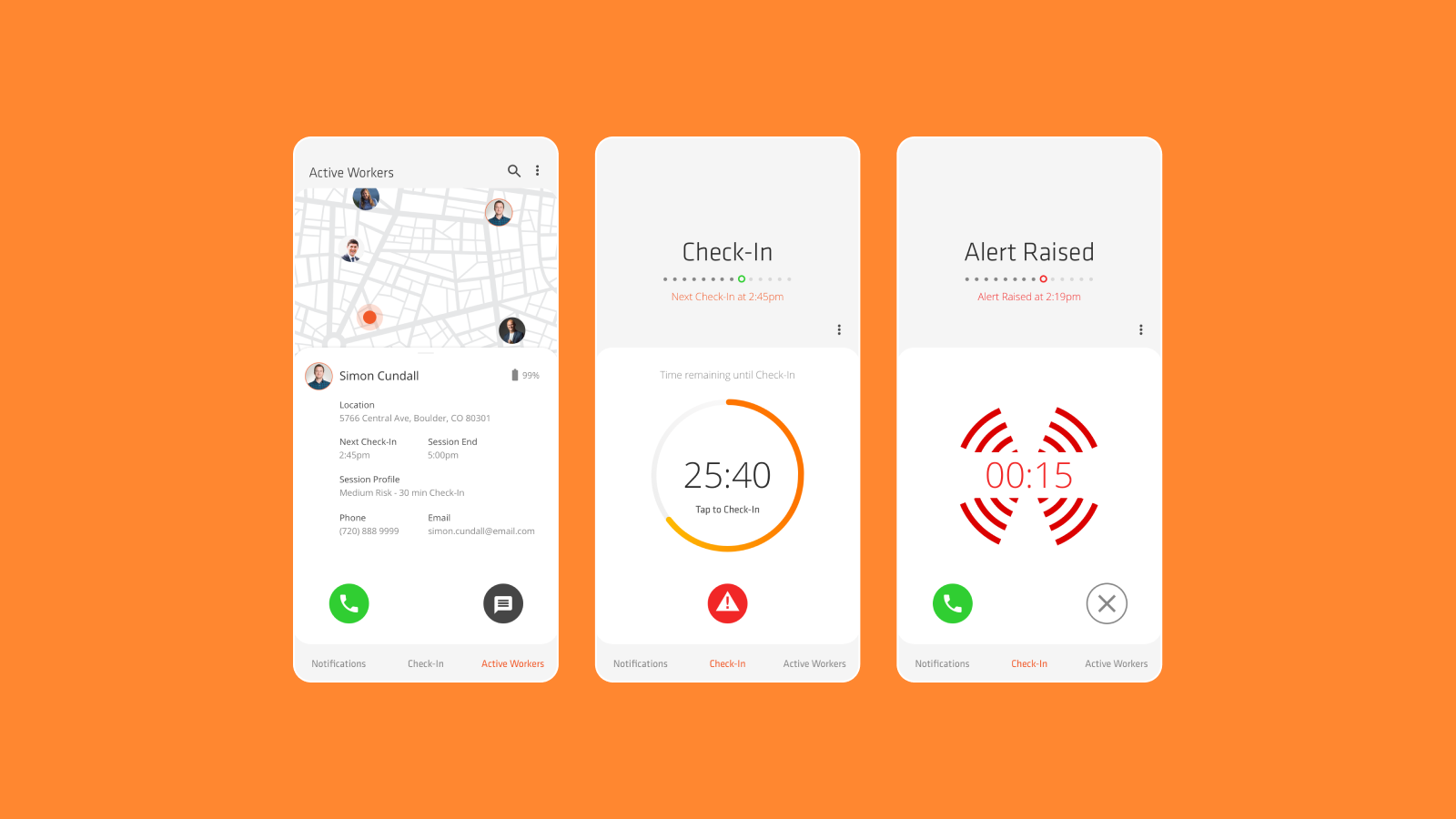
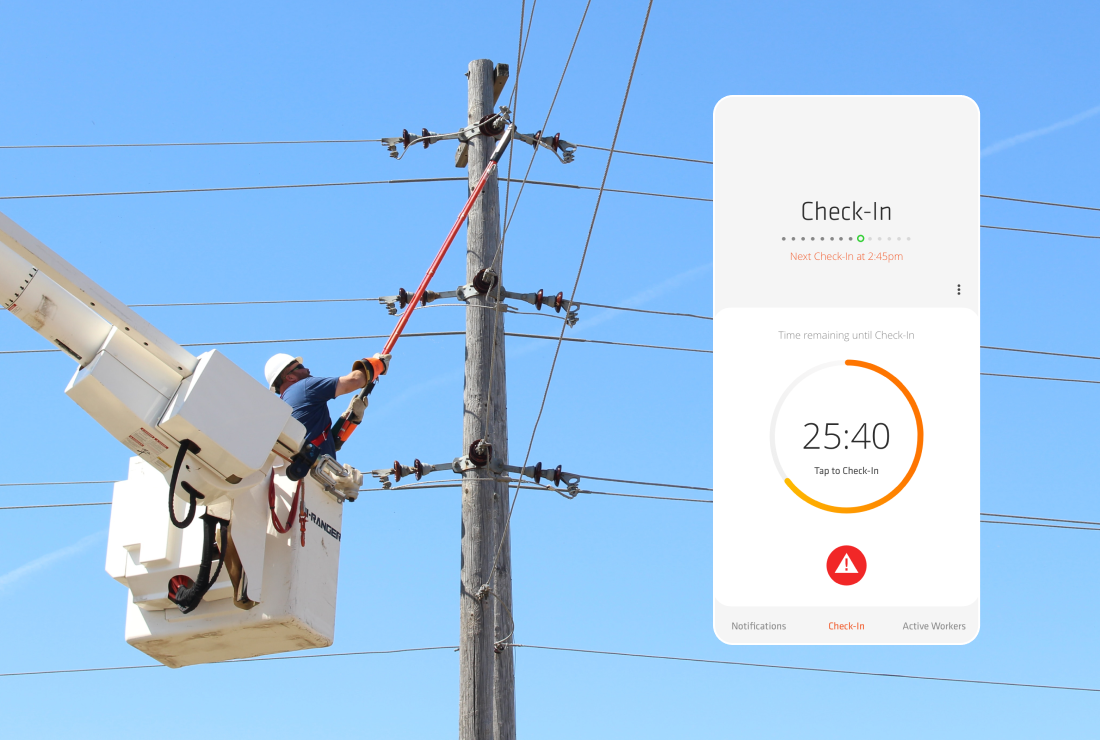
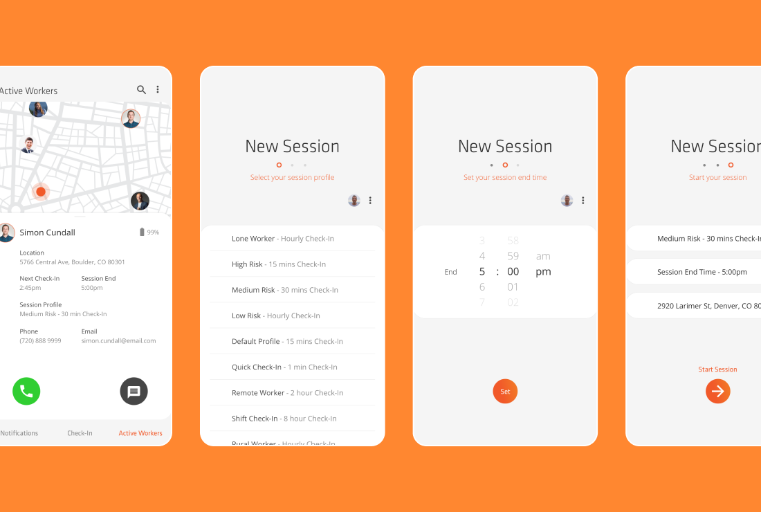
I was contracted to design concepts for a set of predetermined screens for the Solo Worker App. These screens allowed the user to perform different tasks. The main goal for the app and the user was the ability to “Check-In” to show they are safe. For this screen there also needed to be the ability to signal when they were in distress, so an alert feature also needed to be easily accessible. The screen was to visually show the time counting down with a countdown clock and make it simple for users to “Check-In” by simply tapping the screen. Other main tasks the application needed to perform were showing all other active users – in both map and list form, with the ability to call, message and view details of those active users.
Approach
I researched competitors and apps with similar features to get a knowledge of commonly used interface layouts and elements of those apps that worked well from a usability perspective.
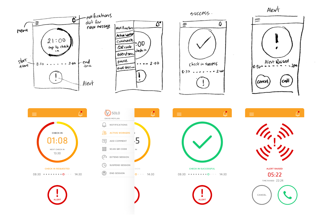
With the list of key features and requirements from the client I produced sketched wireframes of some screen layouts. From there I designed initial screen concepts for review.
One of the outcomes from reviewing and testing the initial concepts was that users needed the ability to easily “Check-In”. In most cases users may only have one free hand to do so if on a worksite. This highlighted the need for all elements on the screen to be within reach of the users thumb, making usability much easier. I produced new wireframes based on this result, moving the positioning of all important elements within reach. To help achieve this I changed the interface to have a bottom navigation to move between screens and menus were moved to halfway down each screen, eliminating the top left sandwich menu and top right notification icon.
Another outcome was the need to a cleaner, more branded style to the screens, to make it easier and clearer for the user to complete their tasks. To achieve this I simplified the interface to have an informational section in the top half of the screen and the important elements that needed to be actioned by the user in the bottom half.


Solution
My vision for the interface was to create modern and professional app. By organizing elements on each screen into either the top half – for informative information and on boarding for the user, or the bottom half – to be within reach so the user can perform their tasks, it gave the app more structure and allowed users to become familiar with the interface more quickly. This contributed to a better user experience.


Results
The app was initially launched on the Google Play Store to cater to the majority of target users on Android, aligning with the cost-effective approach favored by New Zealand businesses. It was then released in the Apple Store. Before the initial release, Vault’s internal development team implemented further UI iterations, driven by cost and time-saving considerations. This was clearly communicated to me, and although at the time I was slightly disappointed, it was understandable from a business perspective. Ultimately, both the client and I were highly satisfied with the design solution. Notably, this project marked my debut in releasing an Android app on the Google Play Store, evoking fond memories. The projects success led to additional contracts from Vault, enabling me to address UX and UI issues across their website and other SaaS products.
